Chartwork consists of a few series – all works in progress – in which I’m addressing the question of where data ends and art begins.
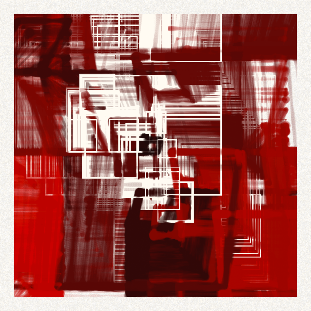
In Systolic, data from an electrocardiogram (ECG) of a heartbeat controls speed and scale of expansion and contraction.
A still from that algorithm:

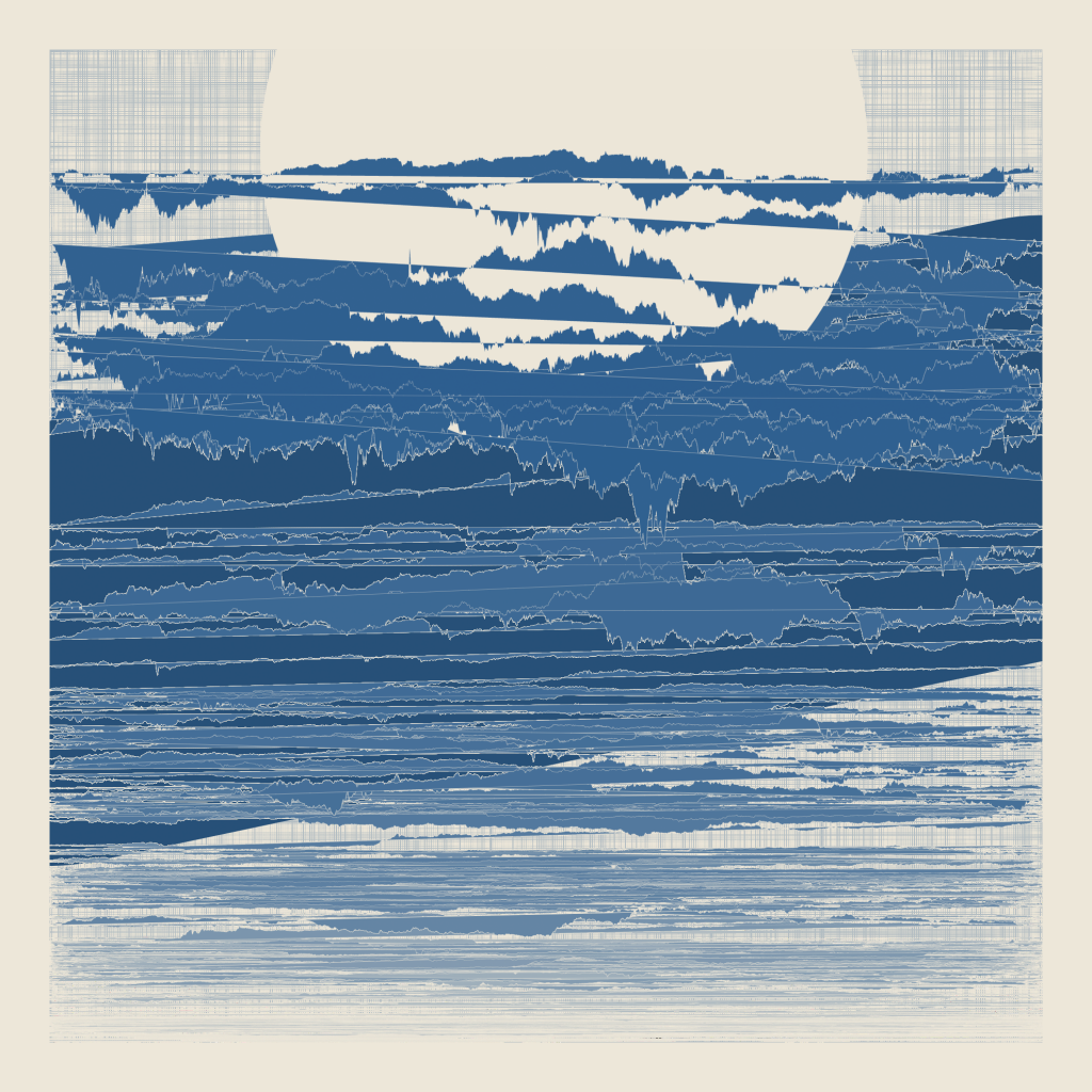
The image below sources a different data set: minute by minute BTC prices over the course of 2017. Each line represents a day, and lighter shades of blue are earlier in the year. The annual trend line appears as a thick solid line, and the 52-week all time high is the center of a giant circle that unintentionally (but inevitably?) evokes a moon.
